
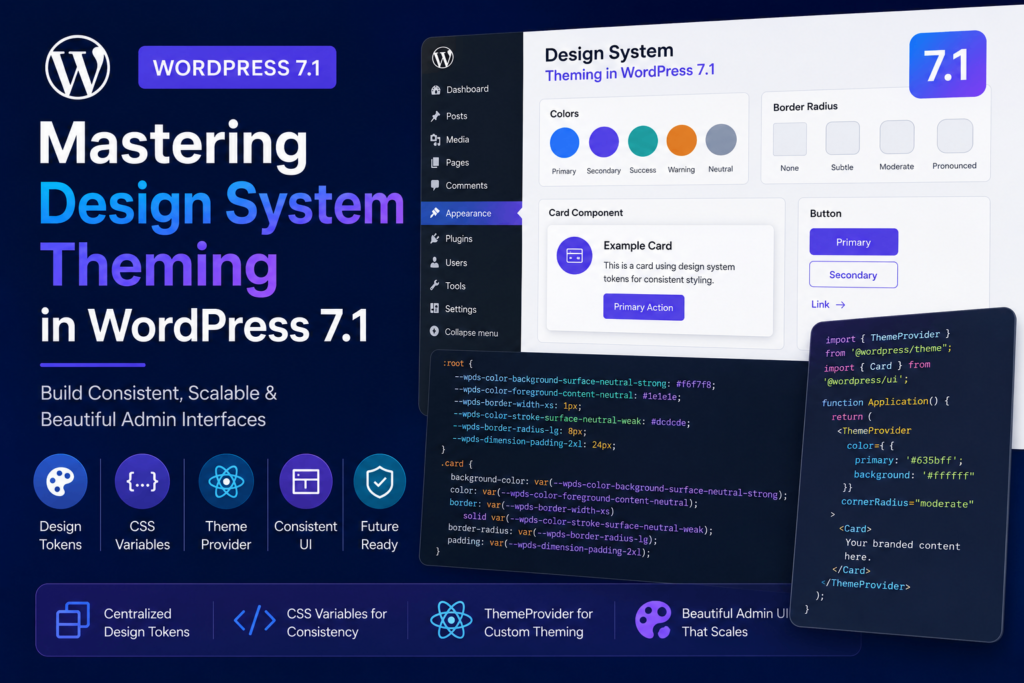
Introduction to WordPress 7.1 Design System Theming
WordPress 7.1 marks a significant evolution in how developers build interfaces within the admin dashboard. By introducing foundational support for design system theming, WordPress is moving toward a more cohesive, scalable, and maintainable UI architecture. This update focuses on standardizing visual aspects—such as colors, border radius, and interactive cursor states—through a centralized system of design tokens and React-based providers.
Understanding the New wp-theme Stylesheet
At the core of this update is the new wp-theme stylesheet. When enqueued, this stylesheet provides a comprehensive set of semantic design tokens formatted as CSS custom properties. Instead of relying on hard-coded values that often lead to visual inconsistencies, developers can now reference these variables directly in their CSS.
For example, instead of defining a specific hex code for a card background, you can use var(--wpds-color-background-surface-neutral-strong). This ensures that if the underlying theme changes, your component automatically adapts, maintaining harmony with the rest of the WordPress admin.
Implementing Design Tokens in CSS
Design tokens are intended to replace static values across your plugin’s UI. By utilizing these tokens, you ensure that your plugin feels like a native part of the WordPress experience. Consider this implementation for a custom card component:
.card { background-color: var(--wpds-color-background-surface-neutral-strong); color: var(--wpds-color-foreground-content-neutral); border: var(--wpds-border-width-xs) solid var(--wpds-color-stroke-surface-neutral-weak); border-radius: var(--wpds-border-radius-lg); padding: var(--wpds-dimension-padding-2xl); }Using these tokens allows your plugin to inherit the user’s preferred color scheme and spacing settings automatically, reducing the need for custom overrides.
The Role of the ThemeProvider Component
For JavaScript-heavy interfaces, the wp-theme script handle provides the ThemeProvider React component. This component acts as a wrapper that overrides default design token values for a specific subtree of your application. This is particularly useful for plugins that need to express a unique brand identity while remaining within the WordPress ecosystem.
The ThemeProvider accepts several props, including color (primary and background) and cornerRadius. When you provide seed colors, the component automatically generates a visually harmonious color ramp, ensuring that contrast ratios are generally maintained.
Practical Implementation Example
Integrating the ThemeProvider is straightforward. By wrapping your UI components, you can define specific design constraints for that section:
import { ThemeProvider } from '@wordpress/theme';
import { Card } from '@wordpress/ui';

function Application() {
  return (


        Your branded content here.


  );
}
Customization Options and Props
The ThemeProvider offers five primary configuration options to control the look and feel of your themed section:
- color.primary: The primary seed color (hex, rgb, or named).
- color.background: The background seed color.
- cursor.control: Defines the cursor style for interactive elements like buttons.
- cornerRadius: Sets the roundness preset (none, subtle, moderate, or pronounced).
- isRoot: A boolean flag to indicate if this is the root document provider.
Limitations and Best Practices
While the ThemeProvider includes an algorithm to generate color ramps, it is not a substitute for manual accessibility testing. Developers must still verify that the generated foreground and background combinations meet WCAG contrast requirements. Additionally, the isRoot prop should be used sparingly; only one root provider should exist per document to prevent conflicting global styles.
Future Outlook
WordPress 7.1 is just the beginning of this design system journey. These foundational tools are expected to expand in future releases, eventually covering more complex areas of the admin interface. By adopting these tokens and providers now, plugin developers can future-proof their interfaces and ensure a seamless experience for users as the WordPress admin continues to evolve.
Frequently asked questions
What is the primary purpose of the wp-theme stylesheet?
The wp-theme stylesheet provides a set of semantic CSS custom properties (design tokens) that allow developers to build consistent UI components that automatically adapt to WordPress admin settings.
Can I use the ThemeProvider to change the entire WordPress admin look?
The ThemeProvider is designed to wrap specific subtrees of your application. While you can set an 'isRoot' provider, it is intended for plugin authors to style their specific interfaces rather than overriding the entire WordPress dashboard.
Does the ThemeProvider guarantee accessible color combinations?
The component generates a harmonious color ramp, but it cannot guarantee accessibility for every combination. Developers are responsible for performing due diligence to verify contrast targets.
Primary reference: Review the original announcement for exact release details. This article is an independent explanation and does not reproduce the source text.